Plex UI Update: Returning to Side-Bar Navigation

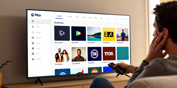
Read Time: 2 min. I recall back when navigation UI updates were supposed to make software faster, not send an entire community into a collective tailspin. Browsing the forums from my desk this morning, I caught the news that the side navigation sidebar is finally creeping its way back into the Roku. After months of user backlash over nested top-bar navigation that buried local media libraries in favor of ad-supported content, the developers apparently caved to community feedback. The UI tax we pay If you have spent any time maintaining a home media server, you know the unspoken rule: the technology tax is a time you love to waste until a software update breaks basic navigation. For months, Plex pushed a redesigned interface across TV streaming platforms. It stripped away the familiar left-hand navigation bar, forcing users to click through awkward top-level menus just to find their own local hard drives. The change was clearly intended to surface free ad-supported TV and streaming content, but it alienated the core user base that built the platform. Returning to a side-bar layout isn’t a revolutionary feature. It is a necessary retreat to functional design. Learning nothing from the past This isn’t the first time a major software vendor tried to force a radical interface redesign at the expense of core functionality. Microsoft tried the exact same maneuver back in 2012 when they stripped the Start menu out of Windows 8, replacing it with a full-screen, tile-heavy interface aimed at tablets. Desktop users hated it, productivity plunged, and Microsoft was ultimately forced to backtrack and restore standard desktop navigation in Windows 10. Streaming platforms and media players keep making this mistake because design teams prioritize corporate strategic goals over muscle memory and basic usability. Why layout actually matters To understand why people were so upset, you have to look at how media players function on a TV screen. On a living room device controlled by a standard remote, vertical scrolling down a left-hand sidebar takes minimal effort. Horizontal top-bar menus require multiple extra directional presses just to switch from one media library to another. When you hide primary folders inside sub-menus, you create unnecessary friction for simple daily tasks. Bringing back the dedicated left menu keeps key sources visible at all times, making navigation fast and predictable again. A rare win for the community It is genuinely encouraging to see developer feedback loops actually work for once. Software companies rarely admit when an interface experiment fails, usually preferring to double down on unpopular changes until users adapt or leave. While the update is currently limited to preview and beta builds on select platforms, it signals a welcome shift back toward user-centric design. My wife can finally grab the remote on movie night without asking me where the local media library went, which is a massive victory for home lab harmony. Hopefully, the stable release rolls out across all devices sooner rather than later.





Leave a Reply